RESEARCH
FIRST PITCH
OUR PROTOTYPE

We are the canvas to your ideas.
Here we display some of the updates on our workflow, including previews of documents, videos, photos and other media that showcase what we are working on.
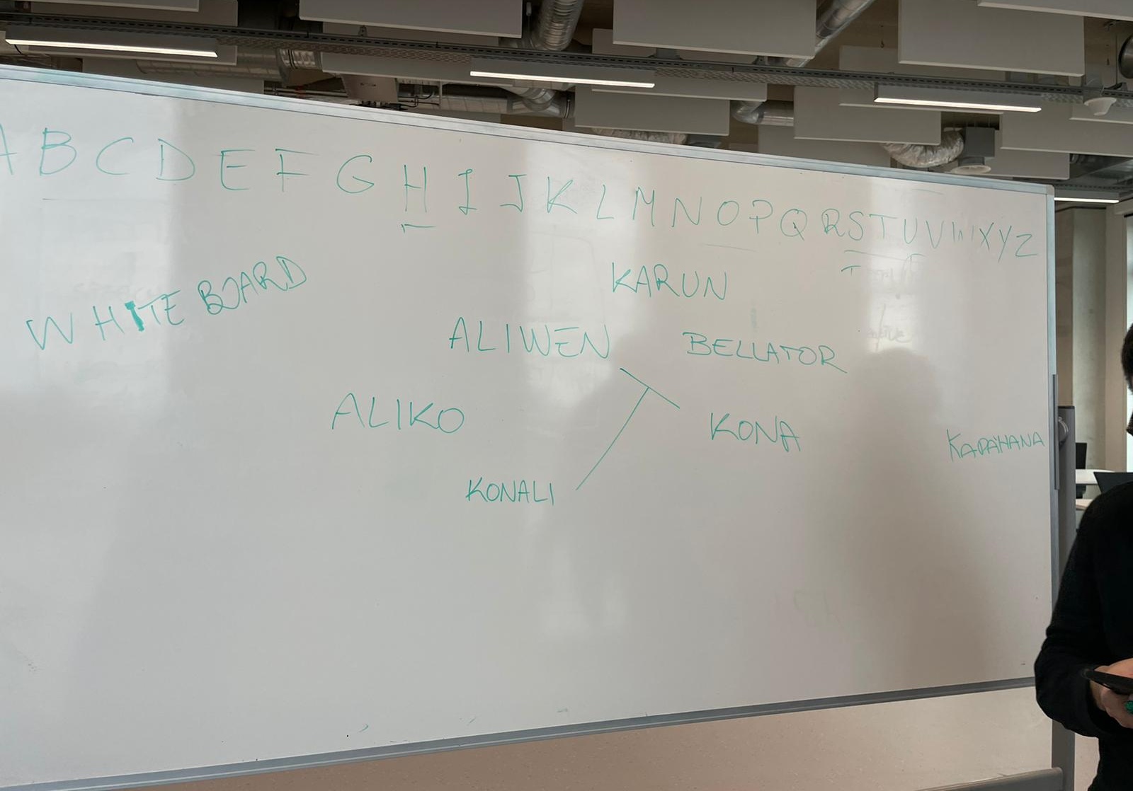
The very first brainstorm session. We had to decide the name of the company and went with the basics, fast-thought with the letter indicated. Ironically this would be the base for our current name.
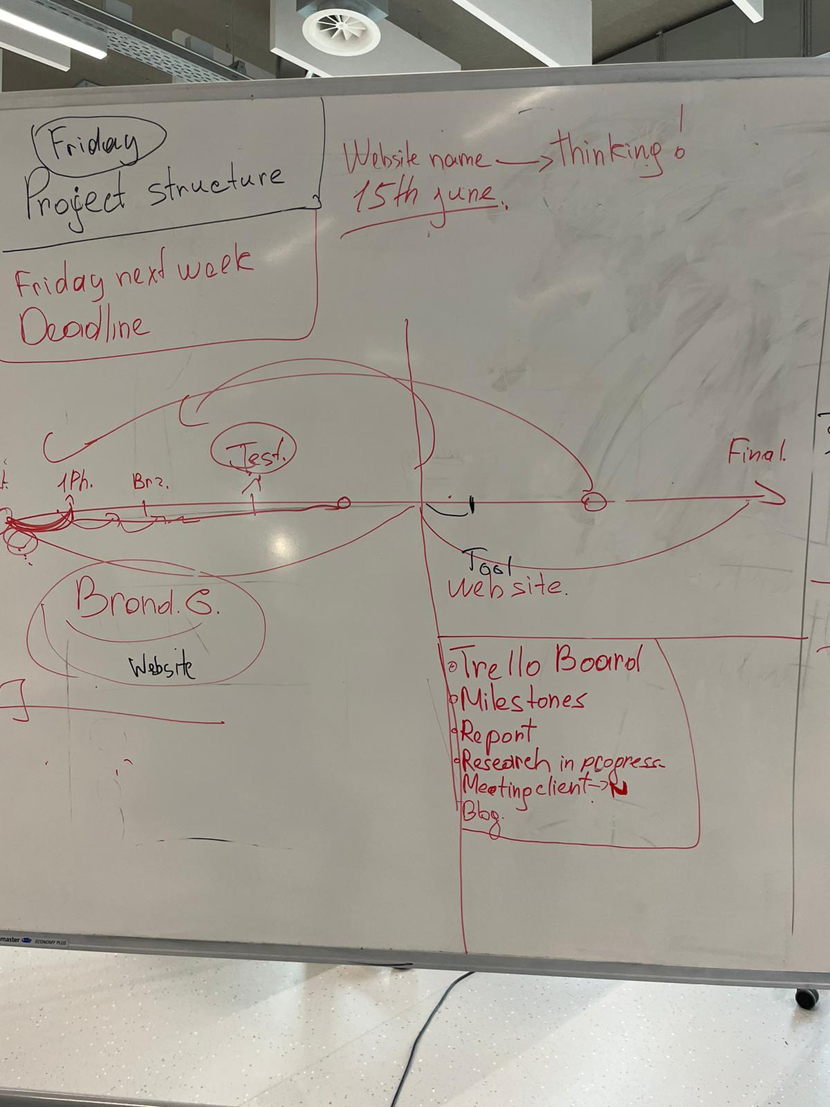
Working on a timeline for the project was not an easy task, as the team was still not sure by the time the specifics of the project. But once we managed to convey the ideas we had, making it was easy.
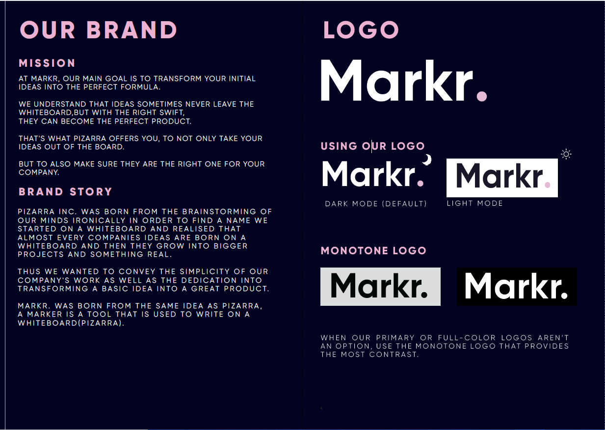


We renew the menu page because we wanted to show more brand guides without the necessity to scroll through all the different options, we change this in our own after seeing in the testing and feedback classes from the teacher that it was going to be a slow process.
We renew the color page because the layout wasn’t the best and we knew this from feedback from the teacher also in the tool we will be adding the part of dividing the colours by section that can be created by the user
Added the alert option because Maikel and Josh mention will be useful so the user doesn’t have to go back every time they make a mistake this alert will also warn them, so the user doesn’t make that many mistakes
We also renew the side bar due to some research we took after some of the own testing’s we did in the tool this research was to keep exploring similar tools because we thought that the total customization of the side bar for making sections for the BG was a must
Added the filter and tab option also from research from similar tool and concepting on the idea of assets management this feature was also talked to the teachers for advice and improvement this will be useful because the user will be able to organise the assets better. We remove the grid option from the prototype because of time reasons but it will be a should have in future versions. Changed the save to select option on the assets of the logo part due to feedback and testing from the teachers they point out that the old save option will get confusing for the user.
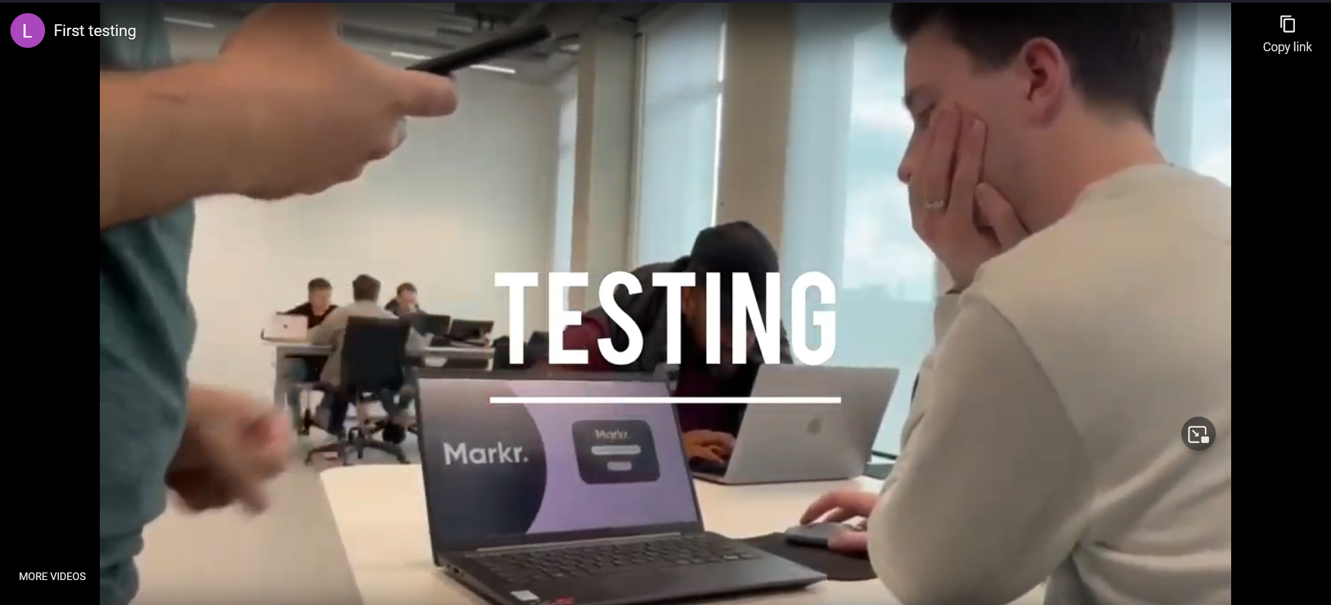
Sven Jeurgens Testing
From Sven what we got from the testing was first that the testing was smooth and that there weren’t many stops for the tester. From the question we got that the side bar it was pretty clear, and it was easy to change he also like the display of the media and the tab and filter option he fended easy to edit the logo and the saving alert was useful. The layout of the colour palette was good and improved but he was wondering if the colour will change when printed but he wasn’t 100 percent sure. The sharing the BG page option is very convenient but we should think to make the shares per page or section so is easier to remove people that don’t work with them anymore. Also change the markr in the side page to the respective logo of the company.
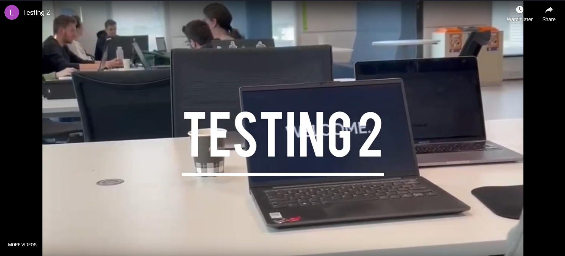
Barend Eijkenduijn Testing
From Barend what we got from the testing was that the testing was smooth, but he wanted the page to be less empty from the sides and better margins through the contents of the page. From the design part he like the logo also he like the side bar because is clear and good looking also he liked that he could add more brands and the bottom was too primary. He did find easy to find the logo thorough the logo assets he also remarks that he like that all the logo are visible so he don’t have to click to open them a see them. The alert should have a better design, but it was useful. He didn’t like the layout of the first colour pallet where it didn’t let him organise it by sections like primary and second colours. He said that the design does make easier his way of working some of the features will his work smoother. He thinks the concept reflect very well the task that the assignment gave us and that he will probably choose it as his tool of choice based on the concept and testing
Here we would like to introduce you to our brand new tool, Markr.! a web tool that makes Brand Guide creation and edition as simple and engaging as possible. Markr is the edit tool for you, the tool for everyone.
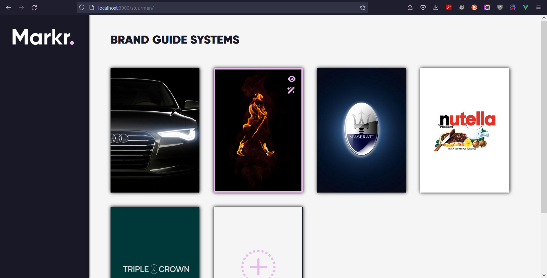
Here you can see the Homepage of Markr., where the user can see all the BGS that they have been working on, or created a brand new one.
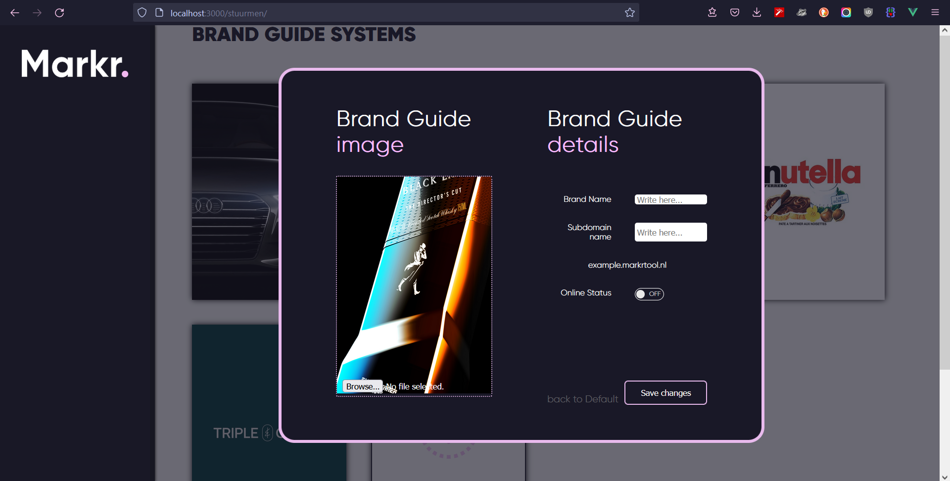
In this page, the user can also edit the details (like the cover or the subdomain) of their new or preexisting BGS with just a few clicks.
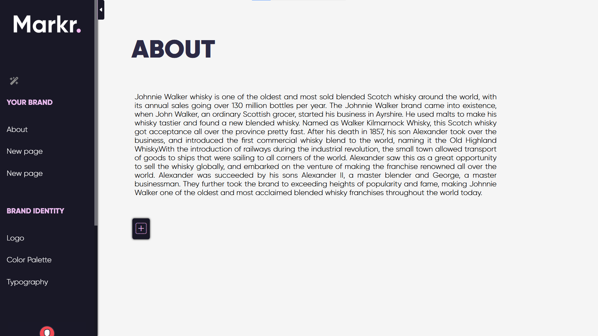
In every new page of their BGS, the user will have access to a series of elements that they can add, delete and edit at their will.
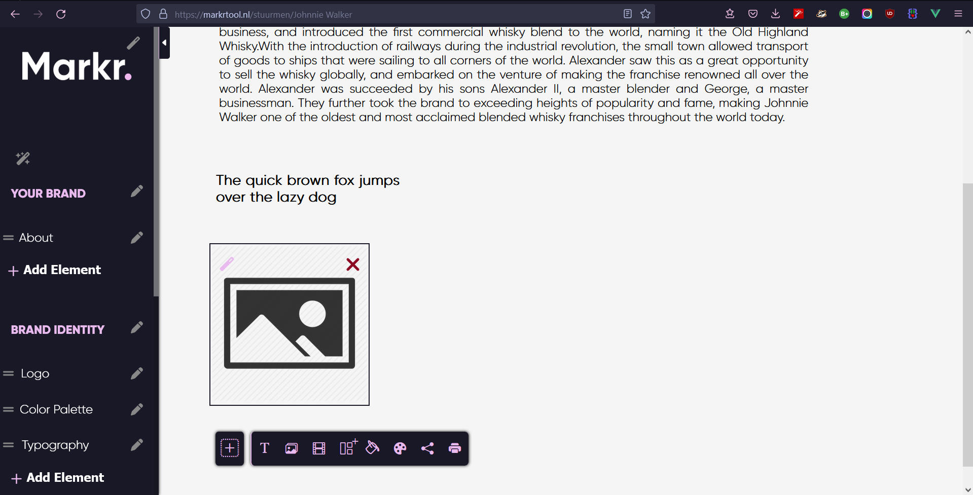
The user can also edit the elements in the Sidebar, so that it aligns better with their brand. From adding new elements, to moving them around or simply changing the font and color, almost anything is possible.

Markr. Tool Preview
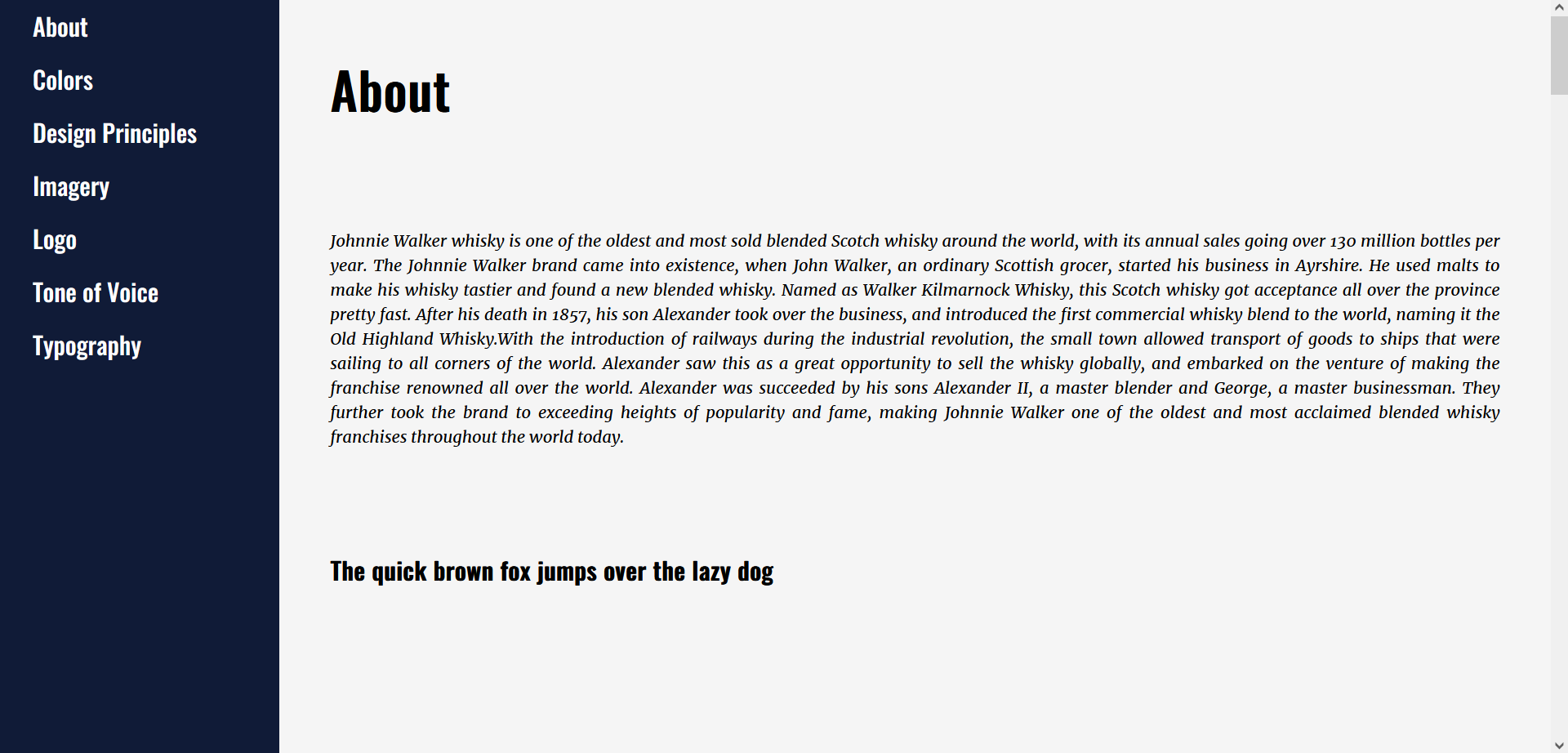
Display BGS Preview
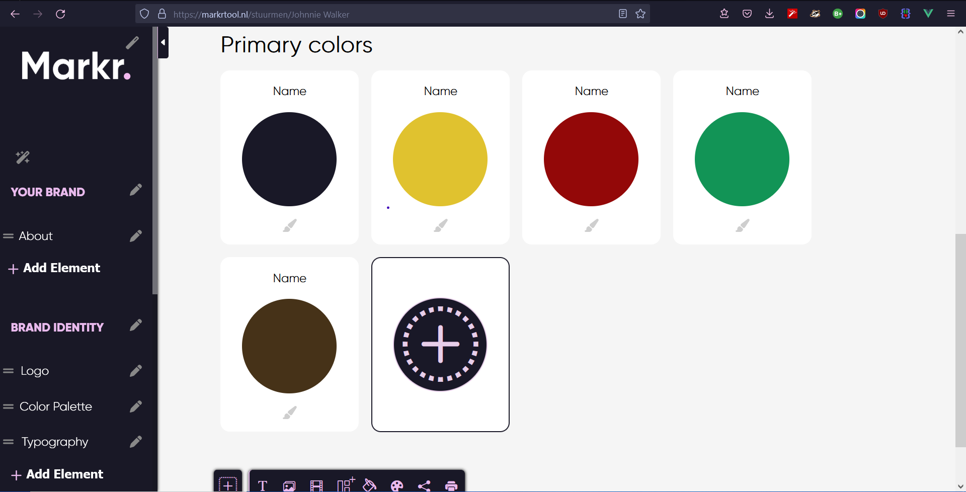
Markr. Tool Testing
Here we can see the Pizarra team in some of the meetings we had. Here we discuss from basic brainstorm sessions to different elements for our Markr. tool.
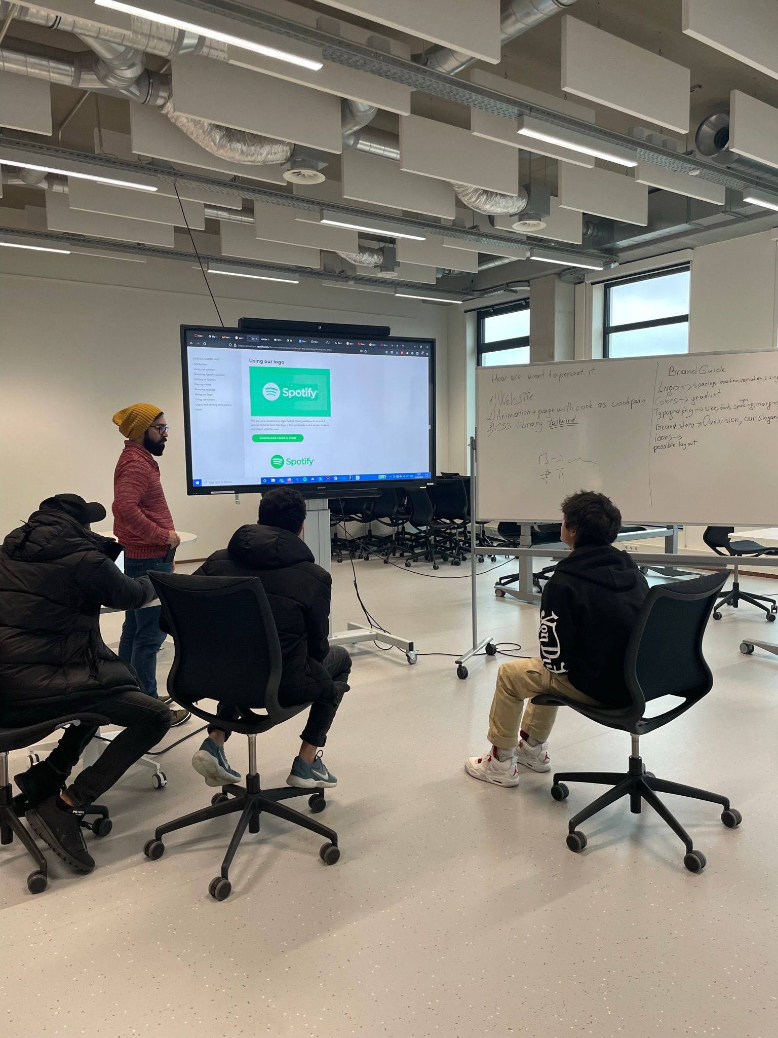
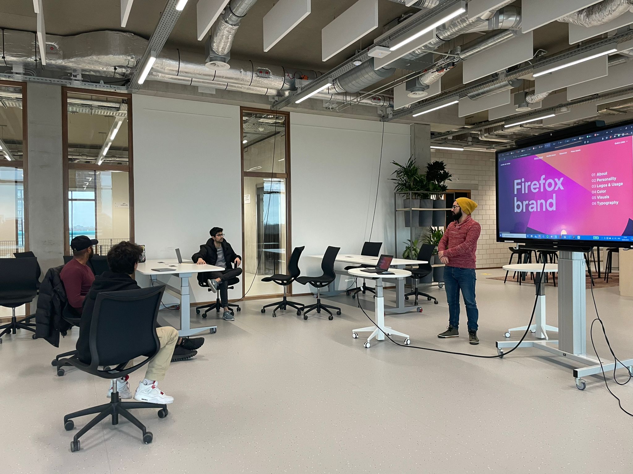
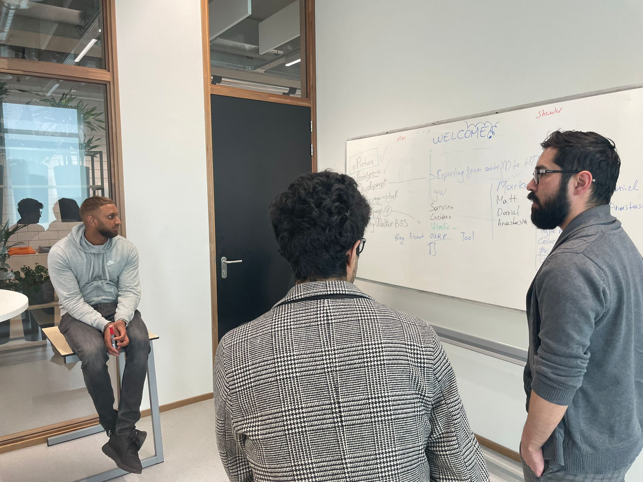
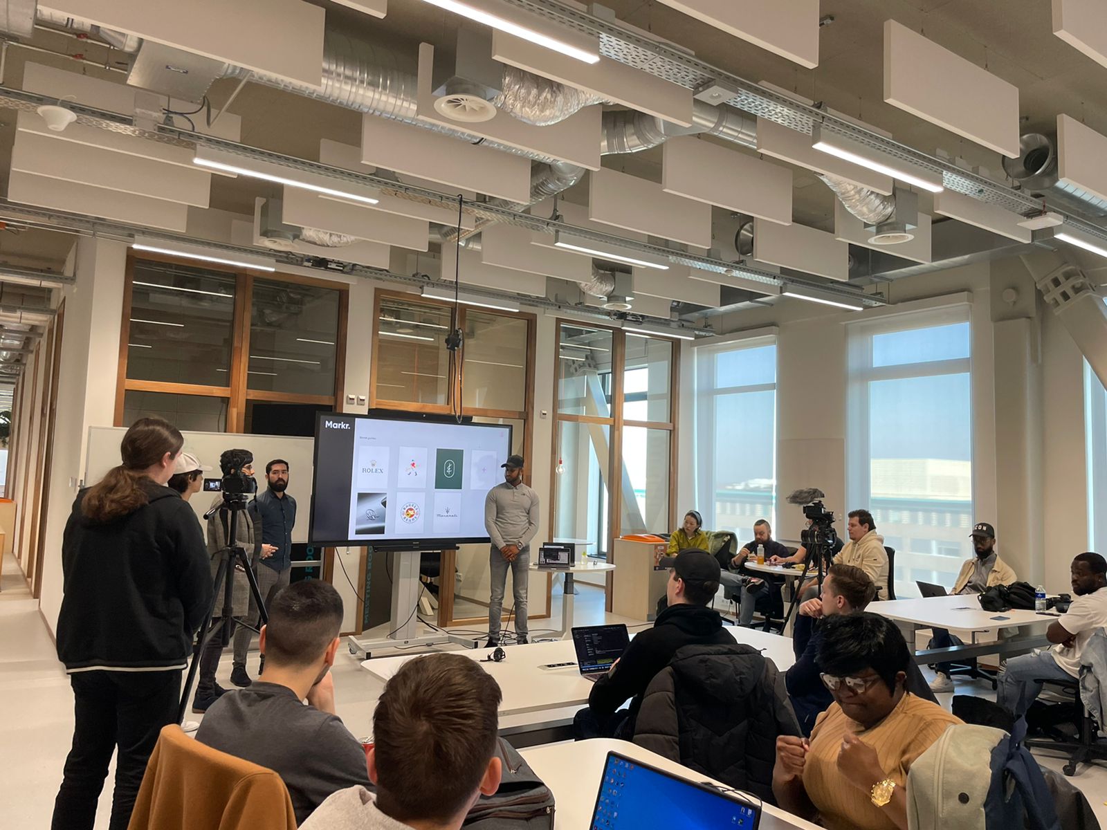
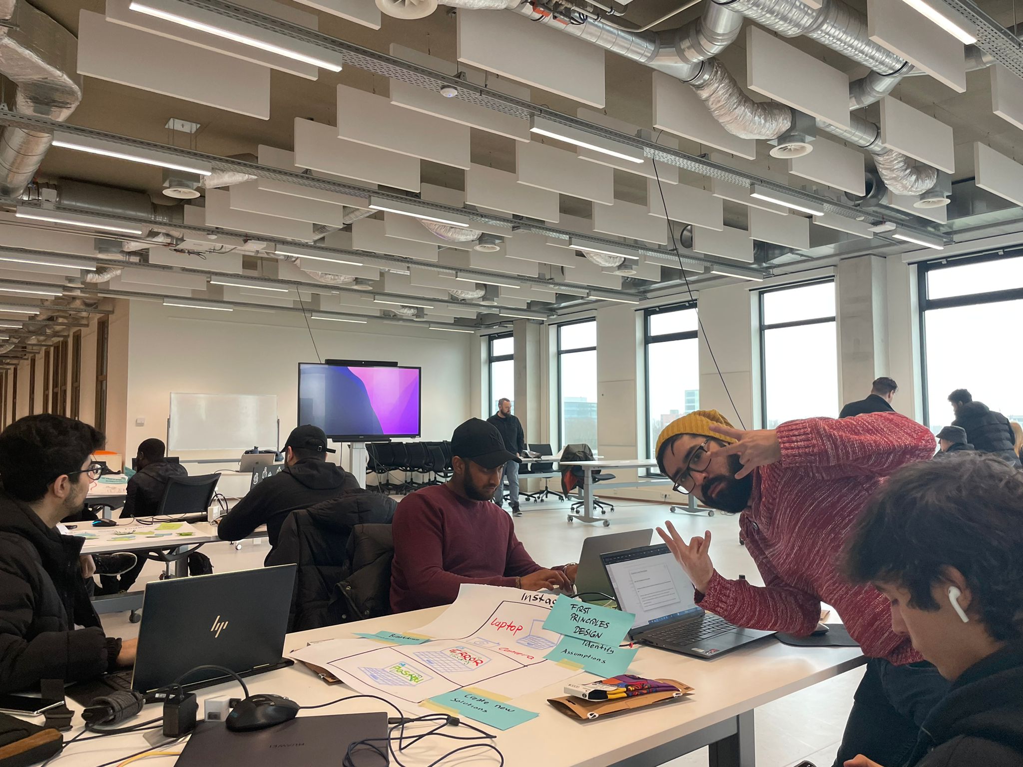
Be it for a very serious Product Pitch, or for an important team meeting, we can't lose our goofiness and good vibes.
.png)
Stuurmen Interview
.png)
Prototype Testing
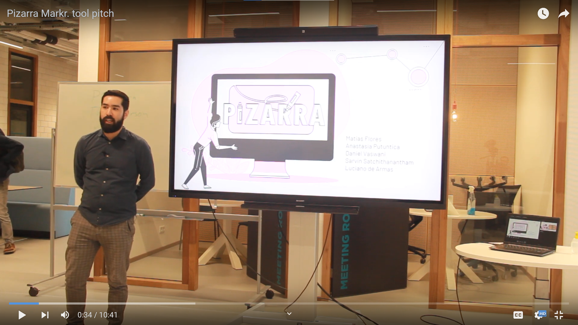
Markr. pitch to Stakeholders

Matias Flores
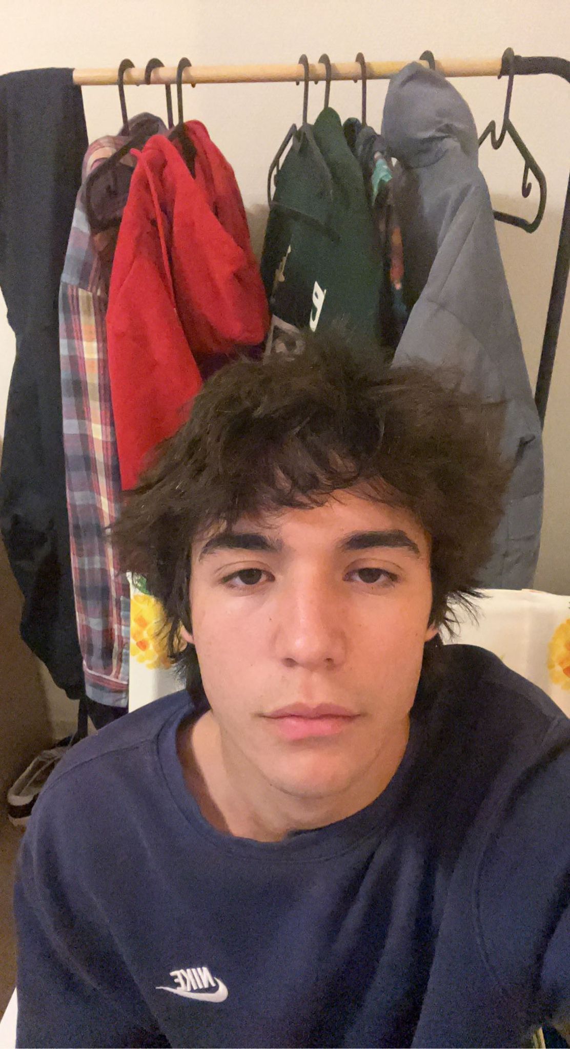
Luciano de Armas

Sarvin Satchithanantham
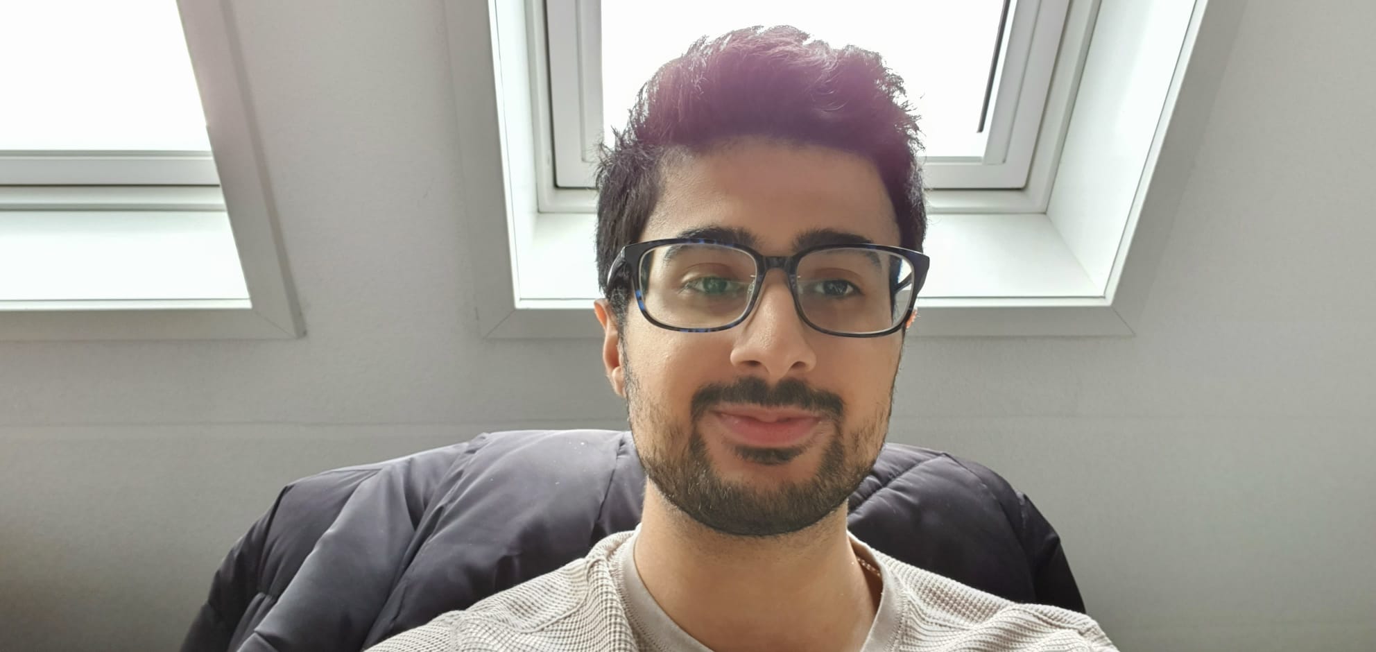
Daniel Vaswani

Anastasia PuŢuntica